Creative Brand Strategy: Task #3— Campaign Branding
09.05.2022 - 19.06.2022 (Week #7 - Week #12)
Seerat Tayyab Mukhtar Qureshi - 0345576 (BDCM)
Creative Brand Strategy
Task #3— Campaign Branding
1. Lectures
2. Instructions
Module Information Booklet
3. Campaign Branding
With the design direction done I started working on my applications. The first thing I started on was the logo for my campaign, What Makes Us Human. I started with a mind map of the campaign.
Fig 1.0: Campaign Mind Map
I also came up with some possible visuals I could include in the logo or in the applications in general.
Fig 1.1: Possible visuals
I then worked on some ideas for the logo and showed them to Miss Lilian for feedback.
Fig 1.2: Logo Attempts
Ms Lilian gave me some general feedback and told me to keep expanding and exploring my ideas.
Fig 1.3: More logo exploration
I liked the new font I tried (New Spirit) and so did Ms Lilian so I decided to come up with some more ideas using the new font.
Fig 1.4: New Spirit font logo exploration
With more feedback, in the end, I just decided to keep it simple and follow the original badge style I had.
Fig 1.5: Final Campaign Logo
With the logo done, I worked on my applications next. The first thing that I did was work on my posters.
Fig 1.6: Poster attempts 1
I worked on some more to show Ms Lilian.
Fig 1.7: Poster attempts 2
Ms Lilian told me to try and remove the outlines for my logo to stand out more and for the posters to look a bit more cohesive. She also told me to experiment more with my bold colours and shapes.
I also reworked the headline texts because they were a lot of orphans and some of the typesettings were off.
Fig 1.8: Poster attempts 3
Fig 1.9: Poster attempts 4
The first three were looking better but the "We are unique" poster still needed some work. Whilst reworking that I also came up with some more ideas.
Fig 2.0: Poster attempts 5
Fig 2.1: Poster attempt 6
The rest were all done but Ms Lilian advised that I rework the body text of the "We are unique" poster for it to not have so many spaces. It was interrupting the reading flow and reducing the emphasis of the quote.
Fig 2.2: Poster attempt 7
It was looking much better and finalised my posters and moved on to the other applications.
Fig 2.3: Final Poster 1
Fig 2.4: Final Poster 2
Fig 2.5: Final Poster 3
Fig 2.6: Final Poster 4
Fig 2.7: Final Poster 5
Fig 2.8: Final Poster 6
Fig 2.9: Final Poster 7
Fig 3.0: Final Poster 8
Next, I worked on my website layout. I started with a wireframe.
Fig 3.1: Main website wireframe
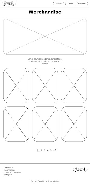
Fig 3.2: Merchandise wireframe
It was a fairly simple and straightforward layout and Ms Lilian said she wanted to see the visuals next week.
Fig 3.3: Website attempt 1
Fig 3.4: Website attempt 1
I agreed with Ms Lilian that the colours weren't working too well and it was not consistent with my design direction. She suggested I try more bold colours and make it more on-brand with my campaign.
Fig 3.5: Website attempt 2
Fig 3.6: Website attempt 2
Although it was better it still lacked the boldness of the posters and the art direction in general. Additionally, the colour blocking wasn't really working and Ms Lilian advised me to try and remove the images from the bounding boxes and see how it works
Fig 3.7: Website attempt 3
I think the new buttons looked a bit odd and the images were a bit clashy with the mockup image. Ms Lilian said I could try removing the button shape altogether and make it text only. She also felt the images weren't really looking appropriate to my message and maybe I could include something with more protests.
Fig 3.8: Final website layout
Fig 3.9: Website scroll
Fig 4.0: Final Website mockup
I also did my merchandise and added them to the website layout as well.
Fig 4.1: Final merchandise page
Fig 4.2: Final merchandise page
Next, I worked on my other merchandise. I started off with some stickers.
Fig 4.3: Sticker attempt 1
Fig 4.4: Sticker attempt 1
Ms Lilian gave me some general feedback on the visuals first. She said that the use of the "4" instead of "for" might make it look a bit unserious. I mentioned I used it because I felt it would be more appealing to younger audiences, she suggested I do a quick survey and gauge the opinion of the younger audiences.
The result of the survey was that more people picked the "for" instead of the "4" so I worked on changing it and also improving the other visuals.
Fig 4.5: Final black and white stickers
Fig 4.6: Final colour stickers
I worked on my hoodies, t-shirts and tote bags next.
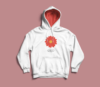
Fig 4.7: Final Flower Hope hoodie
Fig 4.8: Final Bloom hoodie
Fig 4.9: Final Simple Question hoodie
Fig 5.0: Final Hope Blooms tee
Fig 5.1: Final Power tee
Fig 5.2: Final Unity tee
Fig 5.3: Final Unity Circles tote
Fig 5.4: Final Hope Flower tote
Fig 5.5: Final Us tote
Fig 5.6: Final packaging mockup
I worked on the social media posts next.
Fig 5.7: Instagram post attempts 1
They definitely needed some work and Ms Lilian gave me feedback on how to improve. She said I should add snappy and bold covers and try and break down the content a bit.
Fig 5.8 Final Instagram carousel 1
Fig 5.9 Final Instagram carousel 2
Fig 6.1 Final Instagram carousel 4
Fig 6.2 Final Instagram carousel 5
Fig 6.3 Final Instagram carousel 6
Fig 6.4 Final Instagram carousel 7
Fig 6.5 Final Instagram carousel 8
Fig 6.6 Final Instagram carousel
Fig 6.7: Instagram carousel video
Fig 6.8: Instagram carousel video
I did mockups for my other applications as well and compiled it all in a final PDF.
Fig 6.9: Final sticker mockups
Fig 7.0: Final social media mockups
Fig 7.1: Final poster mockups
I compiled them all into a PDF and embedded in the mockup videos as well. To view, download it and open it with Acrobat.
Fig 7.2: Final Campaign Branding PDF
4. Feedback:
Week #7: This week Ms Lilian gave me feedback on my new campaign name and logo. She said that keeping it simple was a good idea since my campaign branding is quite bold and bright. I need to work on some more explorations for next week and maybe try a few different shapes and meanings behind them. She also said to start work on my website framework and start building more of my content.
Week #9: After some more logo exploration I have a more solid idea of what I want it to look like. I think the new font is working well and Ms Lilian suggested I make some tweaks to it in order to make it stand out more.
As for my posters, I need to work more on them and make them a bit bolder and experiment more. My social media posts are a bit too texty right now and won't really work on social media. I can experiment more with the carousel feature as well. I should also remove the outlines from my visuals to help my logo and branding stand out more. Overall, I need to improve the visual execution and make it more consistent with my art direction.
Week #10: I need to break down and expand some of my social media posts. They need to have more snappy covers in order to work on social media. The text formatting on my Hiroshima post needs to be reworked. The website still needs a bit more work, I should work on the buttons and visuals to make them a bit looser and take away some of the borders. It is not really looking consistent with my visual direction. Some of the stickers need small changes as well.
Week #11: Ms Lilian advised I change some of the pictures on my website to make them more appropriate to my message. I can try text-only buttons and remove the lines dividing the pages. I can try joining the BREAK THE VIOLENCE text and visual in the sticker to make it one big sticker. Additionally, I can find another t-shirt mockup because my current one isn't very nice. I now need to work on my other merchandise and compile all my work into final slides
5. Reflection:
Experience: I felt that the experience of this final project was similar to that of brand corporate identity last semester but a little different in some areas. It was interesting to learn how brands plan out strategies and think about the journey their potential customers will follow. Sometimes it was a bit frustrating to have to rework the strategy again and again but in the end, that is all a part of creating a visually exciting and meaningful experience for the customers.
Observation: I enjoyed observing some of the movement ideas my classmates came up with. They were all really interesting and some were quite unique. It's also interesting to see how we unknowingly follow the customer journey maps that brands have meticulously planned out and researched.
Findings: I found that although this module is a bit similar to brand corporate identity there are some additional things that we didn't learn before. This module focused more on the arbitrary and ambiguous aspects of a brand like a customer's experience and journey while BCI was more focused on creating the physical things of a brand.
6. Further reading:
I read more about customer experiences and mapping since I changed my customer journey map after task #2. I felt like it was a good idea to revise it before starting my visual execution.
This article goes in-depth about how to map out a journey and experience. An important point to note was the gaps that can come between the customer's experience and how we need to consider those. Some of them were;
- Gaps between devices, when a user moves from one device to another.
- Gaps between departments or sections, can lead to easy frustration.
- Gaps between channels, where the experience of going from social media to the website could be better.
Additionally, another thing to consider is the delays that a customer might face on their journey. It could be in the awareness or in the consideration stage. By creating effective and efficient touch points we can allow the customer to become a part of the campaign a lot faster.
I did rework some of my touch points after reading this article and removed some unnecessary and extra steps I had initially added to my customer journey map. I think it definitely made the experience a bit more seamless and concise.
.png)


.jpeg)


Comments
Post a Comment