Brand Corporate Identity: Project #3
08.10.2021 - 31.10.2021 (Week #7 - Week #10)
Seerat Tayyab Mukhtar Qureshi - 0345576 (BDCM)
Brand Corporate Identity
Project #3
Lectures:
Instructions:
Module Information Booklet
Project #3
In this project, we have to create a brand profile and start compiling the applications of the logo we have created in Project #2. I started by creating a rough moldboard of the vibe I wanted from my brand.
Fig 1.0: Monday Moodboard
After this, we had to get started on the applications so I looked at some references for the applications I wanted to create.
Fig 1.2: References
I also started working on my brand profile. Ms Li Lian gave me some feedback on my brand positioning statement and so I amended that.
Fig 1.3: Brand Profile
I started the applications, they were a bit of a miss the first time.
Fig 1.4: Environment Attempt #1
Fig 1.5: Stationary Attempt #1
Fig 1.6: ID Card Attempt #1
Fig 1.7: Clothing Tag Attempt #1
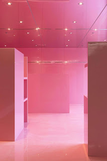
These weren't working well and Ms Li Lian told me to look further. So I looked for more inspiration from Pinterest and refined my brand identity so I could have a clearer idea. I came across this studio on Pinterest and I really loved the layout of it and it was perfect for my brand's bright, futuristic yet still nostalgic vibe.
Fig 1.8: Environment graphic #1
Fig 1.9: Environment graphic #2
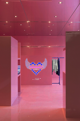
I then attempted to Photoshop a neon sign of my logo into the shop and showed it to Ms Li Lian
Fig 2.0: Environment graphic attempt #2
Ms Li Lian said it was much better suited but did not look like a clothing store because it was too empty. So I tried to photoshop in some clothes and a rack.
Fig 2.1: Environmental graphic attempt #3
I agreed with Ms Li Lian's feedback and thought this version looks much better. Once I had a clear idea of what I wanted my environment to look like, I found other graphics more easily.
Fig 2.2: Environment graphic
Fig 2.3: Environment attempt #2
I realised the perspective was a bit off and the logo was a bit too skewed so I redid it.
Fig 2.4: Environment graphic attempt #3
This looked much better in my opinion and I started working on some of my other applications. Since I put Monday.com everywhere, I decided to create a website interface as well. I looked at some of the brands that Monday is inspired by and their website layouts. They all seemed to be kept minimalist with graphics/images.
Fig 2.5: Chrome Hearts website for inspiration
I created a layout using illustrator first and then imported it into a mockup template.
Fig 2.6: Website layout
For the collaterals, I had to do 2 more in addition to the clothing tag and ID card and I wanted them to be relevant to a clothing shop as well. I decided to do a shopping bag and a staff T-shirt.
Fig 2.7: T-shirt Back
Fig 2.8: Front
For Week 10, I compiled all my progress together and showed Ms Li Lian all the collaterals I had been working on.
Fig 2.9: Week 10 progress
She gave me small improvements to make. Overall she said everything was looking good. She said I should try a coloured logo on the shop front. For the t-shirt, the logo should be on the left and maybe I should remove the website from the bottom because it might be a bit demoralising for the staff. After her feedback, I changed some things and got ready to submit the final. Overall, she said my brand was funky and daring and the collaterals should represent them. I could afford to be a bit more daring in my design as well.
Below is my final submissions,
Stationary
Fig 3.0: Letterhead & Continuation Sheet
Fig 3.1: Business Card
Fig 3.2: Invoice
Collaterals
Fig 3.3: ID Card
Fig 3.4: Clothing Tag
Fig 3.5: Shopping Bag
Fig 3.6: Staff Shirt Back (Option 1)
Fig 3.7: Staff Shirt Back (Option 2)
Fig 3.8: Staff Shirt Front
Social Media and UI
Fig 4.5: Final Logo Applications Submission
Fig 4.6: Final Brand Profile Submission
Feedback:
Week #9: Ms Li Lian said that I needed to make more progress and experiment more. My environment did not match my brand and I need to find more suitable references. My clothes tag was also not too good. The logo was too small and the layout wasn't great. Ms Li Lian mentioned I should experiment more and escape the sort of boxy look I was creating in a lot of my applications.
Week #10: Ms Li Lian gave me some little things to improve on such as removing the lines from the letterheads and express a little bit more playfulness in my work. I also should not repeat the logo on my business card and instead maybe try and put it on the inside. I should try a colour logo for the storefront by photoshopping the base white. I could use both my patterns on the shirts as well to create two options.
Reflection:
Experience: This project was a bit of rapid experience, to be honest. We had to be quite fast with our progress since its the end of the semester. I enjoyed experimenting with my applications. Sometimes it got a bit frustrating because I had a creative block and couldn't decide on what my brand was going to be. It was quite pushing but nevertheless, I liked it as it sort of brought my brand "to life."
Observation: My classmates were having some of the same struggles as me. Ms Li Lian gave similar feedback to some of us. To explore more, more references, more ideas etc. I observed that I was getting frustrated because I couldn't produce the visuals I had imagined in my head because obviously, I had to rely on the internet for sources that were close enough. During the week, anytime I went out, I would observe fashion brands and their stores to see how they had built an identity. I was actually noticing little details and sometimes I could see places in which the brand identity of a particular brand was not being conveyed properly. It was really interesting to observe all these and it really expanded my perspective.
Findings: Brand identities are hard. You are essentially crafting and creating thoughts and perceptions. These are arbitrary and ambiguous things and so you have to be very clear in what you want your brand to be. Everything associated with your brand will affect how people perceive your brand so you have to make sure that your identity is 100% in everything you do.
Further Reading
This is Not a T-Shirt By Bobby Hundreds
I finally got to finish the book I started in the last project. I really enjoyed it and was quite inspired by it. During this project, I found myself relating to the struggles of The Hundreds and their desire to create a unique identity. I could see my own struggles with making sure my work reflected Monday and what I envisioned it to be.
The author discusses opening their first-ever store in Fairfax, Los Angeles and how they wanted to make sure that everything in the store represented their brand. They talked about everything from the art installation to the type of shelves the store would have. Everything had to have a bit of The Hundreds in it. This was particularly moving for me because of how much time and thought went into it. Even though my project was only a few weeks, their brand was pretty much their entire life, our goals were similar.
This book is a great account of what it is like to shape a brand from scratch. From nothing, you create something that influences and inspires millions of people. To be honest it kind of inspired me to try and make Monday a real brand LOL, maybe in the future... :)


Comments
Post a Comment