Publishing Design: Task #1— Exercises
23.08.2021 - 24.09.2021 (Week #1 - Week #5)
Seerat Tayyab Mukhtar Qureshi - 0345576 (BDCM)
Publishing Design
Task #1— Exercises
1. Lectures:
Formats:
Our focus this semester will be the format of the book. It is the oldest format of publishing and one of the most influential and important formats. Various different factors influence the format of a book. The targeted reader, the type and amount of content and more. The format constitutes the binding, the paper and the size.
In Mesopotamia, around 10,00 years ago, the first writing system was developed from a counting technology to keep records of things.
In the Indus Valley System, they used cuneiform. It is one of the earliest forms of writing and was written on soft clay tablets. They kept records about their government, religion etc. Palm leaf manuscripts were also used as writing mediums.
In Egypt, the scribes were the only ones who could eat and write Hieroglyphics. They wrote on a special paper called papyrus.
In China, the characters in the early period were written in vertical columns, so a thin strip of bamboo is ideal for a single column. The earlier known printed book is Chinese from the end of the T'ang Dynasty.
Chinese publishing in the 10th -11th century used wood blocks for publishing which was a laborious process. The characters had to be carved in reverse and then printed. Movable type was an innovation that was pioneered in China but achieved in Korea.
Parchment was first invented in Turkey, 197-159 BC which later spread to Europe. The use of paper spread slowly throughout the world. However, the folding format started to take a foothold in the west at the turn of the century.
History of Print:
In AD 175, the emperor of China commanded that the 6 main classics of Confucianism be carved in stone. The scholars lay the paper on these slabs and rubbed charcoal all over them.
The invention of printing is an achievement of Buddhists in East Asia and the world's earliest known printed document is a sutra printed on a single sheet of paper in Korea in AD 750.
As mentioned in the previous lecture, the earliest printed book was in China. It was a 16 feet long scroll and a foot high. It also contains the world's first printed illustration. Printing through woodblock was a laborious process but it was unavoidable until the invention of movable type.
The movable process type was unpractical in China due to a large number of characters and the use of clay to cast their characters. Koreans solved this by using bronze and inventing their own national alphabet.
More than 6 centuries after the east, printing from woodblocks is introduced in Europe. Gutenberg was experimenting with movable type but he, unfortunately, died unknown as his inventions were taken over until research was conducted and his name was found again. One of his great achievements is the development of the printing press.
Fun fact, the world's largest book is in Mandalay Hills in Mandalay, Myanmar
Typography Redux
This lecture is a recap of what we have done in the previous semesters. Typography is the most important area in graphic design to master. There are many characters in a typeface such as small caps, numerals, fractions, ligatures, punctuations, mathematical signs etc.
Legibility is of utmost importance and the first step is to choose typefaces that are open and well proportioned. For books, we need to make sure the typeface is meant for long periods of reading.
Underlining should also be made legible. Most programmes handle it incorrectly. The underline should be lowered so that they do not touch the characters as this impeded readability.
Small capitals are good for subheads or for the first line of a paragraph. Text set in all caps should be used in short headlines or subheads. All Caps should never be used for long sentences and emphasis as it is a form of punctuation.
Moving on, a column of type is usually about 50 characters across and no more than 65. We will need to adjust the font size and leading to make sure to enhance legibility. The leading is always 2.5-3 pts more than the type size. Other factors also need to be taken into consideration when adjusting the leading.
Paragraphing spacing is an elegant way to space paragraphs.
For indents, it should be equal to the type size. However, using paragraph spacing and indents is overkill. Indentation should also be used for justified text instead if left-aligned. Hyphens, En-Dashes, Em-Dashes and drop capitals are form special formatting. Sidebars are also an important feature. The leading should be the same as the leading of the body text to ensure cross-alignment.
Lectures continue in Task #2 post
The text would be written in the rectangular space formed leaving space for margins at the side. This would be used to balance the layout.
2. Instructions:
Module Information Booklet
3. Exercises:
Content Generation:
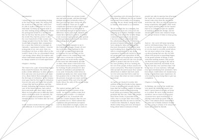
For task 2, we need to do a write up of 3000 words on anything we want. It should be divided into chapters and each chapter must have 2 subtexts and 1 pull quote.
Fig 1.0: Content PDF
Ex 1. Mockup: Book Size
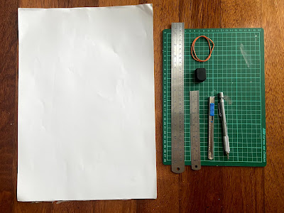
For this exercise, we have to create 3 pages that are smaller than an A4 but bigger than an A5. We have to fold the A3 paper in half and measure out various sizes.
Fig 1.1: Supplies
I picked out the three sizes mentioned below:
- 200 x 250mm
- 170 x 240mm
- 190 x 230mm
Fig 1.2: Size exploration
At first, I decided to go with 190 x 230mm, so I followed Mr Vinod's suggestion and cut it out. After cutting it I realised I was not happy with the ratio so I tried 170 x 240mm and cut it out. I liked this ratio a lot more and decided to go with that.
Fig 1.3: The 2 different sizes I cut out
Fig 1.4: Binding the spreads
Fig 1.5: Rubber band binding
Fig 1.6: Open book
Fig 1.7: Flip through
Fig 1.8: Final book vs other sizes
Ex 2. Signatures
This exercise is about how book pages are formatted for printing. The first step was to fold an A4 paper 3 times.
Fig 1.9: Folding
We then had to add page numbers to each of the folds and open the paper back up.
Fig 2.0: Formula used to make signatures in books
We then bound it using a staple and trimmed the edges to make the pages open up.
Fig 2.1: Staple bind
Fig 2.2: After trimming
Ex 3A: Van De Graff grid
In this exercise, we had to create the Van De Graff grid on the size of our book. This grid system was used by scribes to format text.
Fig 2.3: The Van De Graff grid
Ex 3B: Van De Graff grid in InDesign
Fig 2.5: Van De Graff, JPEG
Fig 2.6: With visible lines and grids
Fig 2.7: Van De Graff, PDF
Spreads and grids:
In this exercise, we first started by dissecting spreads from the same source and seeing how they reflected in the other spreads.
Fig 2.8: Dissecting spreads
Next, we had to come up with three different margins for our book format.
Fig 2.9: Book margins
We had to pick the one we liked the most and experiment with the columns and guides. I picked out the second margin and went ahead with it.
Fig 3.0: Columns
Using this we then needed to create grid systems.
Fig 3.1: Grid systems
Lastly, we needed to add our text to observe the space and relationship between the layout and the text.
Fig 3.2: Flowing in the text
Form & Movement
Fig 3.3: Form & Movement Thumbnail PDF Attempt #1
Fig 3.5: Form & Movement Thumbnail PDF Attempt #2
Fig 3.6: Form & Movement GIF #2
The next step was to introduce colour into the layout
Fig 3.7: Form & Movement with Colour
Once Mr Vinod told us it looked good, we then had to add an image to match our layout. The image had to be placed in an interesting and non-repetitive way.
Fig 3.8: Form & Movement with a photo
We then had to add a headline and body text to the layout.
Fig 3.9: Text attempt #1
Mr Vinod said that I only needed a title and body text and the pull quotes and other text elements were unnecessary.
Fig 4.0: Form and Movement with Text
4. Feedback:
Week #1: Since it was our first class of the semester today, Mr Vinod gave us an overview of the module. He gave us general feedback from previous years, such as keeping our blog updated and filling in the feedback sheet. He also said we should focus on coming up with 3000 words for our book by next week.
Week #3: This week we did our grid systems exercise in class and Mr Vinod helped us through it. He gave us general feedback on how to make our compositions more dynamic by creating tension. He looked through some examples and then told us to try adding the text in ourselves.
Week #4: For my first form and movement attempt, Mr Vinod said it was good but the last two spreads were a bit weak since they were predictable. We have to create forms in a way that makes the reader want to turn the page. For my second attempt, some of my spreads were a bit too complicated with too many elements, Mr Vinod said that it was good and with some improvements, it would be fine.
Week #5: Mr Vinod looked at my form and movement layout from last week and said that my second attempt was better and that I should go with that. For my text attempt 1, he said that it needed to be a bit more consistent with only the body text and title. Subtexts and pull quotes aren't necessary.
5. Reflection:
Week #1: This module does certainly seem quite challenging, but having the opportunity to create, design, and publish our own book is pretty cool. I know it won't be easy but I can tell that the end result of all the hard work will definitely be worth it.
Week #3: I enjoyed dissecting the magazine spreads, I thought it was quite interesting to see how professional magazines use grid systems. The book margins exercise was quite insightful too, it was a bit hard to come up with variations using a similar grid system, but nevertheless, it was still a good learning experience.
Week #4: I actually really enjoyed the form and movement exercise. I thought it was really interesting to make the forms flow through each of the spreads and have them be connected in a way that is not too predictable. I think I have a good grasp of the concept but with practice, my compositions will get better too.
Week #5: We are done with our exercises for this module so now we can move on to designing our book. Overall I think I have enjoyed the exercises and they were a really good introduction to what publishing design is all about. The text part was a bit tricky but eventually I'll get it with some practice.
6. Further Reading:
In one of our classes, Mr Vinod mentioned to us an article he wrote on Kreatif Beats about form and movement. I really enjoyed the form and movement exercise so I decided to give the article a read.
I really liked the part where Mr Vinod talks about the early years of this exercise and how he came up with it. The students doing it by hand using paper and glue was quite interesting and in stark contrast to how we did it in class. The incorporation of magazine cut out images and text created a captivating composition and it enhanced my understanding of the concept even further. By reading about the origins of form and movement, I am quite intrigued because, to be honest, it is not something I would have normally noticed in a book. However now, I think it will be hard for me to not notice it.
Overall, at first, this exercise can seem to be a bunch of meaningless shapes but once you understand it and how it came to be, it can be quite exciting to try it and see what you can come up with. It has made me look forward to designing my book and laying out the visuals and text.


Comments
Post a Comment