Advanced Typography: Final Project— Type Exploration and Application
07.06.2021 - 21.06.2021 (Week #11 - Week #13)
Instructions:
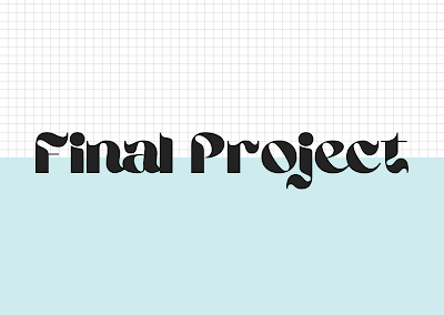
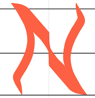
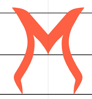
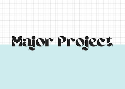
I could clearly see a lot of the letters needed adjusting.
Seerat Tayyab Mukhtar Qureshi - 0345576 (BDCM)
Advanced Typography
Final Project
Instructions:
Module Information Booklet
Final Project:
For this project, I had 2 initial ideas
Fig 1.0: Proposal PDF
[07.06.2021]
Mr Vinod liked my second idea of redesigning the Venom font. I started by looking for references to base my font off of.
I started off by sketching some ideas. Since Venom is part of the Spiderverse, I wanted the font to reflect some web-like qualities in its points and curves.
Fig 1.1: Web reference
Fig 1.2: Sketching
[09.06.2021]
I decided to try and sketch out some of the other letters digitally.
Fig 1.3: Digital sketches
[09.06.2021]
I uploaded my sketches to Ai and traced them with the pen tool.
Fig 1.4: Initial attempt
[12.06.2021]
Fig 1.5: Progress 2
I wanted to see how it looked on a poster so I recreated one.
Fig 1.6: Original poster
[12.06.2021]
Fig 1.7: My recreation with my font
[12.06.2021]
I liked how it was looking, so I presented it to Mr Vinod. He gave me feedback to work on. I also needed to add in numbers.
Fig 1.8: Final font overview
Fig 1.9: Final PDF
The next step was to make it into a usable font so I placed my letters into the software Calligraphr.
Fig 2.0: My font in Calligraphr
You can adjust the baseline and spacing in the software as well.
Fig 2.1: Adjusting space
Once I was happy with the spacing I downloaded the font.
Fig 2.2: Font preview
Fig 2.3: VENOM-Regular.ttf
I wanted to create a proper sort of vintage style movie poster for it to mimic the older comics.
Fig 2.4: Inspiration
Fig 2.5: Final poster Design
Fig 2.6: Poster Design PDF
[21.06.2021]
Fig 2.7: Poster Mockup
[21.06.2021]
I placed the logo on a simple t-shirt too which could be sold as merchandise.
Fig 2.8: T-shirt Design
[21.06.2021]
I also decided on a mug design. I kept one simple and correlating to the T-shirt theme. The other one I added a bit of a comedic effect to, since most people find Venom's appearance a bit creepy.
Fig 2.7: Mug Design
[21.06.2021]
Fig 2.8: Collateral compilation
[21.06.2021]
Feedback:
Week #11: I showed Mr. Vinod my glow-in-the-dark font idea first and he said that it could work and the use of it could be in movie theatres and exit signs. He suggested looking for additional ideas and hence I came up with the idea to redesign the Venom font so that it's better suited to the theme of the movie.
Week #12: Mr Vinod suggested that my font was still a bit crude and needed some refinement. He said that it's as if the font has not settled in yet and I should work on more refinements.
Week #13: The deadline for our project has been extended by a week to give us some extra time to work on further refinements and feedback.
Reflection:
Week 11: I think it's pretty cool that we get to pick out a topic of our choice and design a typeface that interests us and could also solve a problem or enhance an experience. I look forward to seeing what I can come up with and how it can enhance the message of the Venom movie.
Week #12: I am a bit upset after Mr Vinod's feedback as I had worked really hard on my font and I did like how the outcome was looking. Nevertheless, I don't have time to sulk as I have a lot of work to do in regard to this project and other modules.
Week #13: Honestly, I like how my movie poster and font have turned out. I know it's not perfect but I think it looks cool and I feel like I struggled so much on this project to the point where I thought I would never be able to come up with something substantial so I guess all is well that ends well.
Further Reading:
I continued reading through Indie Type as I am finding it quite interesting and intriguing.
The images below are taken from the book for educational purposes only with no intention of reproduction or transmission. All credit goes to Sandu Publishing Co., Ltd.
Brand Brothers (continued) (Week #11)
They created an identity for the project Artskop3437, a new platform dedicated to all arts disciplines in Africa. They worked with the founders from the very beginning and were in charge of the overall artistic direction. The logo is based on a typographic design designed in the studio and the stand-out element is the S.
It is meant to stand like a sculpture in the middle of the name. The logo highlights in a simple and raw way the silhouette of Africa in the S. I found this especially cool because when one looks at the shape of the African continent, S isn't the letter I would associate with it. But with the creativity and skill in this logo, the S seems to mimic the shape almost perfectly. The cut-off at the bottom is what brings the design to life.
Brand Brothers (continued) (Week #12)
The next project highlighted is for Le Goût des Plantes, a large plant sale in the form of events in major cities of France. Brand Brothers wanted to continue conveying the artisanal and casual side of these sales. They designed a typeface for the brand with inverted contrasts, with vegetal curves to convey a certain kindness, while maintaining a clear structure.
I really like the font they came up with because even before reading the description I could already tell that this font looks like leaves.
Uncurated Studio (Week #13)
Uncurated Studio was tasked with creating an identity for the 2019 Oro Design Conference in the Philipines. Their theme revolves around the literal translation of the word "Oro" which means gold. They decided to make the identity type centric and weave every graphic element to visually translating it typographically.
Cagayan de Oro City is also known for its river and is often associated with countless myths, legends, and folk stories. With this Uncurated Studio decided to use a typeface that would translate the wavy flowy and eccentric characteristics of the river.
Photo taken from Uncurated Studio website


Comments
Post a Comment