Advanced Typography: Project #1A & B— Key Artwork & Collateral
03.05.2021 - 04.06.2021 (Week #6 - Week #10)
Seerat Tayyab Mukhtar Qureshi - 0345576 (BDCM)
Advanced Typography
Project #1
1. Lectures:
DESIGNING TYPE
Designing a type is a form of artistic expression.
The typeface Frutiger was a sans serif font created by Adrian Frutiger for the Charles de Gaulle International Airport in France. The purpose was to create a clean distinctive and legible typeface that is easy to see from both close and far away. The purpose needs to be crystal clear before designing a font. Various things were taken into consideration such as that the letterforms need to be recognized even in poor light conditions or when the reader was moving quickly past the sign. He tested with unfocused letters to see which could still be identified.
Frutiger font
He also designed a new Devanagari font for modern typesetting and printing processes at the request of the Indian Design Institute. His goal was to simplify the sacred characters without compromising their ancient calligraphic fonts.
The next designer is Matthew Carter who created many fonts to address specific technical challenges. The font Verdana (1996) was designed for Microsoft with the purpose to be extremely legible even at very small sizes on the screen due to the popularity of the internet and electronic devices.
His limitations and considerations were that the Verdana fonts exhibit characteristics derived from pixel rather than the pen, brush or chisel. Commonly confused characters, such as the lowercase i j l.
Verdana font
The third designer is Edward Johnston, the creator of the London Underground typeface known as Johnston Sans. He was asked to create a typeface with "bold simplicity". The purpose was to standardise all the different entities under the London Underground Group.
He took into consideration applying the proportions of Roman capital letters so it was rooted in history and traditional calligraphy but it has an elegance and simplicity that absolutely fitted the modern age.
Johnston for the London Underground
General Process of Type Design:
1. Research: We should understand the history, anatomy and conventions. We should determine the type's purpose, what different applications it will be used in and examine existing fonts that are currently being used.
2. Sketching: Some designers use traditional methods such as brushes, pen and paper and then scan and digitize. Some designers use digital toolsets directly into font design software. Both methods have pros and cons.
3. Digitization: Professional software is used in the digitization of fonts. Adobe Illustrator is also used to design or craft letterforms. Attention should not only be given to the whole form at this stage nit also to the counter form. The readability is heavily dependant on it.
4. Testing: Testing is a part of the process of refinement and correction. Prototyping also helps yield important feedback. The category of the typeface determines the importance of readability and legibility.
5. Deploy: Even after deployment, the task of revision doesn't end. This helps us understand how the font behaves in its environment.
Typeface construction:
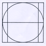
Roman capital: This grid consists of a square and a circle that just touches the lines of the square in 4 places.
Roman capital grid
There are many different considerations when designing a typeface. An important visual correction is the extrusion of curved (and protruding) forms past the baseline and cap line. A visual correction is also needed between the letters. It is not possible to simply place them next to each other with equal space.
PERCEPTION & ORGANISATION
Perception is how something is regarded or rather manipulated into seeing. In typography, it is the visual navigation and interpretation of the reader via contrast, form and organisation of the content.
Contrast:
Contrast is to help the reader separate information and to make the meaning pop it clearly. The contrast of size means that the reader will see the bigger text first and is used to make the title noticeably larger. The contrast created by weight describes how bold type can stand out in the middle of the lighter type of the same style. The contrast in form is between capital and lowercase letters, italics and roman etc.
The contrast in structure means the different letterforms of different kinds of typefaces. The contrast in texture is created by combining size, weight, form and structure and applying them to a block of text on a page. The contrast of direction is the opposition between vertical and horizontal and the angles in between. The contrast in colour is created by different tones. It is important to give thought to which element needs to emphasize.
Form:
Form refers to the overall look and feel of the elements that make up the typographic composition. Form creates the most visual impact and plays an important role in making a design memorable.
Organisation/Gestalt:
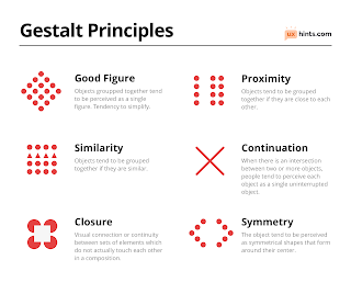
Gestalt is a German word meaning the way a thing has been placed or put together. Gestalt theory emphasizes that the whole of anything is greater than its parts, this is based on the idea that we experience things as a whole.
Gestalt principles
It is important to know these principles because they affect how people perceive and understand design.
2. Instructions:
Module Information Booklet
3. Project #1
For this project, we have to create a key artwork for an event. We were allowed to submit suggestions of events we wanted and then pick from those. I suggested and chose the upcoming exhibition of Sophie Taeuber-Arp at the Museum of Modern Art in New York.
Fig 1.0: Exhibition details
I started off by looking at some of her artwork to get some inspiration on how to create my key artwork.
Fig 1.1: Some of her works
Mr Vinod advised us to start our work in black and white first and once the design is ok, only then add colour. I started by putting a picture of her artwork into my artboard and arranging the information around it to see what type of visuals I wanted.
Fig 1.2: Progress 1
Fig 1.3: Creating some design elements
Fig 1.4: Progress 2
I realised that it wasn't looking like a key artwork so I decided to try again and make it more of a logo rather than a poster.
Fig 1.5: Progress 3
The next step was to add colour to the artwork. I based all my colours on her original artworks to stay true to the theme.
Fig 1.6: Adding colour
Fig 1.7: Trying different variations
Fig 1.8: Progress 4
Fig 1.9: Final key artwork
Fig 2.0: Poster progress
Fig 2.1: Progress
Fig 2.2: Final Poster
Fig 2.3: Final PDF
[23.05.2021]
For my collateral works, I wanted to pick items that would be available at an art exhibition and for the audience to take with them. I thought a paper bag and a water bottle would be interesting and work well as souvenirs.
Fig 2.4: Collateral works
Fig 2.5: Compilation
[26.05.2021]
The next step was to create the animated invite. I used after effects to create a short animated invite.
Fig 2.6: Animated invite progress
[29.05.2021]
Fig 2.7: Animated Invite Final
Fig 2.8: Final GIF
[02.06.2021]
Week #6: I showed my peers both my progress and they all agreed that the first one was not really a key artwork since it's not free-standing and has a bit too many non-objective elements. Mr Vinod briefly mentioned that they were too many grey tones as well. A key artwork is sort of supposed to be like a logo in the sense that it can be used anywhere and resized. The second progress was better and more like a key artwork. They said it represented her works symbolically and was well balanced.
Week #7: This week Mr Vinod went through most of our work and gave us both generic and specific feedback. For my specific feedback, he said that this was looking more like a key artwork, but I had a bit too many colours and even though I sampled it off her artwork, it was too many in a small space.
Week #9: My font size was way too big and I didn't realise it until Mr Vinod mentioned to us that we should imagine how it would look printed out and it would be too huge to read. He said my designs were a bit too safe, which doesn't necessarily mean a good thing. He suggested I rearrange the text in a circle to sort of make it more interesting.
Week #10: Mr Vinod said my animated invite was good and gets the point across, however, I need to vary the speeds a little. The start bit is too slow and could be sped up to improve the flow of the video. Varying speeds also help improve the quality of the video
Lastly, Object Sans, my favourite out of all 3, is a contemporary type family which puts together qualities of Swiss neo-Grosteque and geometric fonts. It is multifunctional and designed to work best with on-screen contexts such as logo design, brand identities, websites, packaging, posters and headlines. I like it because it is a simple font but still unique in terms of its characteristics.
5. Reflection:
Week #6: I had fun working with this project because we had the creative freedom however, I'm a bit upset that I misunderstood a part of the assignment and wasted a bit of time creating work that was not a key artwork. I guess that helped my design process a bit but I have to be more careful next time and make sure I really understand and have a clear direction before starting my design. He also guided us on how to proceed with our poster.
Week #7: I am glad that I was more on track this week. I have a clearer direction than I did last week and I know what I have to do next. This week we had no peer review, instead, Mr Vinod reviewed most of our work. Although it seems better to get feedback directly from Mr Vinod, it's understandable that it's hard for him and sometimes the peer review sessions actually help us overcome some of our inhibitions.
Week #9: This project has been full of hit or misses for me, but I have managed to pull through. It is the last 4 weeks of the semester so it is natural to be a little burnt out. I have made a few mistakes in my design and composition and through feedback and guidance, I think I have learnt from them and hopefully will be better in the future.
Week #10: I was a bit nervous about the animated invite part because I am not a big fan of animation and using After Effects. However, this was relatively simple and I actually finally figured out how to use masks in After Effects as transitions so that was interesting.
6. Further reading:
INDIE TYPE
A few weeks ago I came across this book online and it looked really interesting so I decided to order it. It is about typefaces, their construction and their creative application in design.
The images below are taken from the book for educational purposes only with no intention of reproduction or transmission. All credit goes to Sandu Publishing Co., Ltd.
Alexander Slobzheninov (Week #6)
The first designer interviewed is Alexander Slobzheninov who is a type designer based in the Czech Republic and has designed various different typefaces (Grafier Variable Font, Agrandir Variable Font, Object Sans). He explains his design process and some crucial type principles. The first step of his process is to look at historical typefaces as references. He states it's important to keep new typefaces connected to the classics.
Grafier Variable pays homage to the classic Baskerville font with fresh and precise digital curves, square dots and long connected serifs. It is really interesting to see how Slobzheninov has taken inspiration from a font from the 18th century and brought it to modern times. It definitely helps increase my understanding of the process behind designing typefaces.
The next font looked at is Agrandir Variable Font which is a contemporary sans-serif type family. It is a slightly rebellious font as a funky unaligned font. Since it's a font with tighter spacing, it is best for big size headlines, websites, logos and posters.
Production Type (Week #7)
In this section, the Paris based design agency is interviewed. Production Type creates exclusive type for design professionals and other custom typefaces for the industrial, luxury and media sectors. They talk about what the process is like to design typography for commission-based projects. It's an interesting insight into what the world of commercialised typography is like and what a future career can look like for designers. They talk about how a good typeface should be both good and interesting and always bring something new to the table.
The first font they talk about is Kreuz, which has a unique angular and bulky form. It is inspired by machinery and features characteristics from nuts and bolts. It's cool to see how inspiration can be taken from anywhere and applied creatively.
The next font is Media Sans which features characters with large x-heights. It is made for large sizes where horizontal space is scarce. The collection has 3 different condensed fonts and vertical proportions remain identical throughout all styles. The very short ascenders and descenders are specifically meant for tight line-fitting in lowercase, creating a dense texture within the rhythm of the page. I'm learning more and more about how important it is for a font to have a clear and precise purpose, because well, that decides what it is going to look like. If the purpose is unclear and cloudy, the outcome will not be great.
Mars is the next font which comes in two cuts, an extended and a condensed. It is distantly referenced from the typeface Venus. It features distinct edges and curves, which give it a neat and clean finish. I am a big fan of extended typefaces and found it cool how the designer retains the uniqueness in both the condensed and extended versions.
Production Type (Continued) (Week #8)
Continuing with Production Type, the typeface Sainte Colombe is introduced which is a new serif and comes in five weights. The design is not driven by geometry and symmetry rather the opposite and made to be expressive like music. It has small distinct features such as the notched stem of the lowercase italic "g" curling into itself. Its interesting to see how small features can be used to make serif fonts distinct and unique and give character to the typeface.
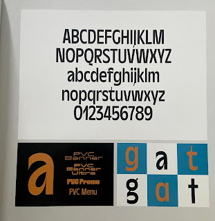
PVC is the next display family explored. It is inspired by the 70s and constructed using a hearty backbone while incorporating different shapes into the letterforms. I found this typeface particularly fascinating because of its construction. The thick strokes are kept consistent through out, however, the notches and curves are designed in an unique and sort of assymetrical manner. Really shows how creative you can be in typography and still create functional type.
Last but certainly not least is Minotaur, a typeface inspired by the cubist movement. It was initially created for a Paris art museum and features some unique characteristics. The letter outlines are atypical but their set number of widths, which are derived from historical limitations, play with expectations too.
Creative Application
Graphéine (Week #9)
This week I decided to skip ahead to the creative application of fonts designed for specific purposes. This is relevant to our upcoming final project in which we have to create a font that solves a problem. The branding agency Graphéine is interviewed and their various different projects are showcased.
The French Ministry of Justice approached the agency and asked them for support in creating a modern and identifiable. They decided to create a typeface inspired by various aspects of the justice system. They made the equal (=) symbol the core of the typeface design and created the Themis typeface which would become the identity of the French Ministry of Justice.
Image taken from Graphéine
The next project focused on is for the Maisons Paysannes de France, an association for the preservation of buildings and rural landscapes. They created stencil lettering which evokes architecture and co-construction. The objective was to create a unique identity and allow the national MPF logo to be declined into 88 decentralized delegation logos.
Brand Brothers (Week #10)
Brand Brothers is a design studio that aim to produce useful, intelligible and beautiful design for companies and brands. Their project Aktuel is aimed to talk about historical actovty of a space planner while developing a new strategic vision. It reminded me of this project especially because they created a similar identity using a key artwork and typography. It is really interesting and maybe even a little reassuraning to see how our assignments and projects are relevant in the outside world and that similar processes exist outside of university.
They designed three major elements to make up the graphic identity; a grid, a dedicated typography and a set of forms.
In a similar manner to our project, they created collateral works too.
Another project they worked on is for The Montgolfière, a majestic and hidden recreational facility in Paris. They worked iwrh the founders of the place to create a visual identity. The logo, a typeface entirely designed for La Montgolfière, is statutory lettering including subtle graphic accidents.
The "O" has been transformed into a monogrom, which is in the shape of an hot air balloon.
They also created collateral works for this project.
They were able to create a unique identity for the brand using simple creative techniques that were functional and intelligent.
I found this book quite exciting because it highlights all the endless possibilities that exist within the dispcline of typography. I also liked the practical and "real life" view of typography highlighted in this book.








Comments
Post a Comment