Typography: Project #1
22.09.2020 - 06.10.2020 (Week 5 - Week 7)
Seerat Tayyab Mukhtar Qureshi - 0345576 (BDCM)
Typography
1. Lectures
Lecture 6: Screen & print
Instructions:
After receiving feedback from Mr. Vinod, he wasn't too happy with my formatting and suggested I make the title bigger and cover one page with it.
Seerat Tayyab Mukhtar Qureshi - 0345576 (BDCM)
Typography
Project #1
1. Lectures
Lecture 3: Text part 1:
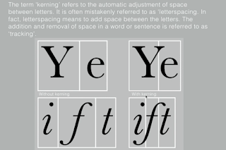
Fig 1.0: Kerning
Fig 1.2: Importance of kerning in formatting text
Fig 1.3: Different types of tracking
Fig 1.4: Loose tracking makes texts harder to read as the patterns are difficult to decipher
Fig 1.5: Differences in grey value affect readability of a font
Fig 1.6: How to make text the easiest to read
Lecture 4: Text part 2:
Fig 1.7: Leading should always be about 2-3 points bigger than text size
Paragraph space should be the same as leading space as it creates cross alignment. If font size is 10 and leading is 13 then paragraph space should be 3 as well (units need to all be in PT). Cross alignment is very important as it maintains the reading rhythm.
Fig 1.8: Line space vs, leading
Fig 1.9: Indentation
NOTE: Best used with justified text
Fig 2.0: Widows and orphans are frowned upon in text formatting
Fig 2.1: Examples of widows and orphans
Fig 2.2: Using different fonts to highlight text
Fig 2.3: Different headings
Lecture 5: Understanding
Fig 2.4: Understanding the subtle differences in letterforms
By understanding the small differences in letterforms, it will help us when we want to design our own typeface.
Fig 2.5: Curves must rise above median line as an optical adjustment
Fig 2.6: Types of contrast
Typography can exist across many mediums including physical and across various screens. We have to consider aspects such as operating systems and browsers when looking at typography online. Different fonts are better suited to screens and to print. Different measures also need to be taken to adapt the font to the medium.
Fig 2.7: Font size differs across screen and print
Motion typography is used in movie titles and other kinetic mediums.
Instructions:
Project #1: Text expression and formatting
For this project we have to create a 2 page editorial spread on InDesign. We can use Ai for any other additional graphical elements we want to include. The given dimensions are 200x200 so I created a document on InDesign with 3 columns and 2 facing pages. I also adjusted the margins according Mr. Vinod's lectures.
Fig 2.8: Creating document in InDesign
Fig 2.9: Turning off allow selected spreads to shuffle
Fig 3.0: Document spread
We were given three options to choose from and I chose the first one titled "The Impact of Bauhaus on modern culture." The first step was the type expression part and I used Ai to try and come up with a way of expressing the title in an interesting way.
I started with something simple first with no graphical elements.
Fig 3.1: Text expression draft
I used Futura because after looking into the Bauhaus school, they tend to also prefer simple sans serif fonts.
Fig 3.2: Bauhaus century edition book
SOURCE: https://shop.bauhaus-movement.com/best-of-bauhaus
I tried to experiment a little bit more with various fonts and graphical elements.
Fig 3.3: Text expression draft
I copied the text and started working on formatting it.
Fig 3.4: Text formatting draft
Fig 3.5: Progress
After formatting it like this, I realised that indeed it looked much better and less cramped up together.
I changed the design after receiving feedback from Mr. Vinod.
Fig 3.7: Final work, JPEG
Fig 3.8: Final work, PDF
Fig 3.9: Final work, PDF
Feedback:
W6: Mr. Vinod told me that my layout wasn't too good and I just had to make a few rational decisions for it to look a lot better. My text expression was good but it wasn't necessarily the best and most unique idea in the world.
Reflections:
W6: Typography has been a tough module so far but I understand its something that you can only get better at through practice and patience. It seems hard at this point since its new to me and I have never tried text formatting and expression. However, this should not be a reason to give up so instead I try and look forward to learning more in the future and eventually becoming somewhat good at at.


Comments
Post a Comment