Design Principles: Task #1 Contrast & gestalt
25.08.2020 - 31.08.2020
Seerat Tayyab Mukhtar Qureshi - 0345576 (BDCM)
Design Principles
Task 1 Exercises
Lecture #1: Design principles & Contrast + Gestalt theory
For our first week, we were given an overview of our module and our next assignment by Dr. Yip Jinchi. We looked at the Gestalt theory and contrast. Our first task consists of producing two works correlating to each theory using black and white paper.
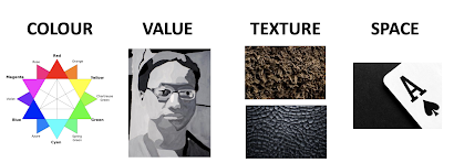
Elements of design:
These were described as individual "ingredients" that come together in a composition.
Principles of design:
These are used to give structure to a piece and help it have a stronger meaning.
1. Balance & emphasis:
Fig 1.1: Balance & emphasis
SOURCE: Lecture slides
Balance: When a composition refers to the "visual distribution" in a composition. In a balanced composition all elements attract the viewer equally. (i.e. symmetry)
Emphasis (or contrast): In a composition, emphasis is used to draw attention to a focal point. This can be done through strong contrast which attracts the attention of the viewer.
2. Repetition & movement:
Fig 1.2: Repetition & movement
SOURCE: Lecture slides
Repetition: The systematic arrangement of repeated shapes that creates a pattern. Brings strength to the design.
Movement: The way the eye naturally moves throughout the design.
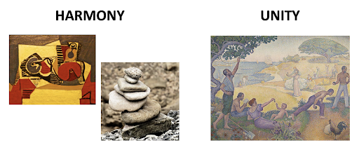
3. Harmony & unity:
Fig 1.3: Harmony & unity
SOURCE: Lecture slides
Harmony: Can be described as the belonging of one thing with another. Harmony can be achieved through repetition and rhythm.
Unity: Similar to harmony, unity gives the work a sense of cohesion and ties the whole work together.
Contrast is used to create visual excitement in a work and add interest. It's a way to grab the attention of the viewer.
Fig 1.4: Contrast is created through stark differences
SOURCE: https://www.pinterest.com/pin/96194142030676516/?nic_v2=1aKWQzpY5
Gestalt theory
There are five principles of the Gestalt theory which were developed in the 1920s. These principles refer to how people perceive the world around them.
1. Figure-ground:
Fig 1.5: Figure-ground composition
SOURCE: https://www.pinterest.com/pin/41236152826588167/?nic_v2=1aKWQzpY5
People will see different things in these compositions as your mind is trying to figure out what comes first. Creates curiosity within the viewer.
2. Similarity:
Fig 1.6: Similarity design
SOURCE: Lecture slides
As long as the images are similar, our brains will tell us that they belong together. This is used commonly in magazine design. Achieved through composition, typeface, numbers etc.
3. Proximity:
Fig 1.7: Proximity design
SOURCE: https://www.pinterest.com/pin/600386194061136067/?nic_v2=1aKWQzpY5
This law states that elements that are closer to each other tend to be perceived as a unified group
4. Continuity:
Fig 1.8: Continuity design
SOURCE: Lecture slides
This law holds the point that points connected by curving or straight lines helps our brain looks for a design in a smooth and consistent flow.
Fig 1.9: Closure design
SOURCE: Lecture slides
This law states that our brain can fill in the gaps and make a complete image even if the visual elements are lacking or incomplete.
Instructions:
Module information booklet
Exercises: Contrast & Gestalt
1. Contrast:
Our first task was to come up with an artwork based on the concept of contrast using black and white paper. I really liked the contrast in this picture between the model and background, so I used it as a starting point for my design.
Fig 2: A$AP Rocky for Dior
SOURCE: https://www.pinterest.com/pin/9218374220756354/?nic_v2=1aKWQzpY5
I sketched out my ideas and shaded in some of the areas that I wanted to cut out in the white paper to create the effect of shadow.
Fig 2.1: From my sketchbook
Fig 2.2: Final work
I liked how this turned out because although it is a simple design, the idea of contrast is strong.
2. Gestalt theory
Our second task was to create a work of design using on of the Gestalt principles. My first idea was to try the figure-ground theory and create an asymmetrical composition where you could see two faces in an extinguished candle flame.
Fig 2.3: From my sketchbook
Dr. Jinchi liked my idea but she suggested I could also try and experiment with a symmetrical composition as well. So I tried a new composition with two symmetrical faces and a sword/dagger handle.
Fig 2.4: From my sketchbook
Fig 2.5: Sketch of Gestalt theory
Fig 2.6: Gestalt process
After showing my work to Dr. Jinchi, she said that the composition was nice, but the handle needed to be longer and to make the sword more ornamental by adding details with black paper.
I really enjoyed this weeks exercise. It pushed me to think in a different way than I am used too, especially the gestalt piece. I found learning about gestalt and how humans perceive things quite interesting. Making of the gestalt piece was a little more challenging than I expected but it stimulated me to think differently and try new things.


Comments
Post a Comment